For many companies, the digital presence is the central medium for communication. It can also be perfectly controlled, planned and checked. No other medium allows so many effective forms of communication in combination.
It is our profession and greatest passion to produce text, image, animation, film and interaction and to combine them into a unique website.
Technology and design
The right combination of modern techniques and established methods is our foundation for successful and stable websites of all requirements. We keep an eye on the continuous technical and legal changes and take into account the current user behavior and the constantly changing Google specifications.
For us, an excellent technical solution always includes an equally excellent design and its high level of user-friendliness.
Our goal is to create a website that communicates perfectly and whose well thought-out design skilfully supports the brand image of your company.
Our websites provide brand awareness, information, interaction and e-commerce.
Individual flexible design and standardized data management
There are basically two ways to create websites with content management:
Modular Content Management Systems (CMS)
contents can be changed by customers without programming knowledge System is flexibly expandable with modules (new pages, forms, galleries, etc.)
Many companies use standardized content layout frameworks for their corporate websites. Especially marketing websites and blogs with a lot of individual design needs benefit from this.
With versatile and modularly expandable modern frameworks, content can be changed easily and quickly afterwards, even without programming knowledge.
Likewise, design updates and common feature enhancements such as marketing widgets, forms and galleries can be integrated quickly and easily.
Rapid Development: Once the framework is set up, current marketing campaigns can be integrated quickly and new design ideas can be tested quickly and cost-effectively.
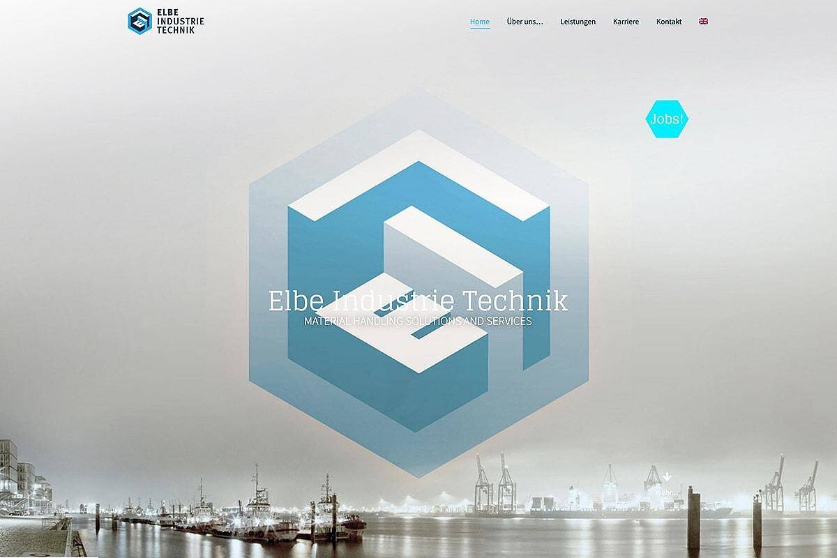
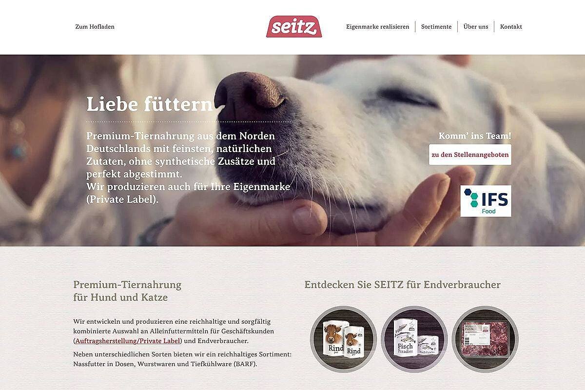
Example: This TBA-Berlin website is based on WordPress in combination with a content builder and some self-developed extras. A highly flexible layout system.
Individual programming CMS with own templates
Maximum individuality and flexibility Competitive advantage over ready-made systems
Individual programming, on the other hand, offers maximum individuality. Websites that have to meet special requirements or manage content in a standardized way (web stores, schools or news portals) are typical use cases. The boundaries to a real web software is also fluid, even small “programs” can be realized this way.
There are hardly any limits to individual data links and evaluations.
User rights and options can be standardized down to the smallest elements, just as with web forms.
Rapid Changes: Standardized content or calculations can often be changed from the layout with just a few lines of code.
Example: For our website management and web hosting accounting, TBA-Berlin uses ProcessWire as an easily maintainable, complex and flexible Software-as-a-Service (SAAS) system. The sky is the limit.
Combinations of both software principles are often interesting, such as equipping a content framework with individual modules or equipping individual software with ready-made program libraries.
WordPress and ProcessWire
Our two favorites
WordPress and ProcessWire are different, sophisticated content management systems that allow us to offer a wide range of possibilities. ProcessWire is custom programmed for you, with WordPress we combine ready-made templates and third-party plug-ins with our own programming and applications.
Because we focus on these two selected CMS systems, we can offer a lot of experience and expertise in using this software and cover many tasks between flexible marketing websites and complex SAAS projects.
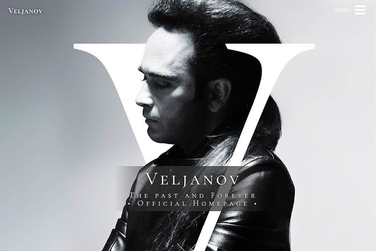
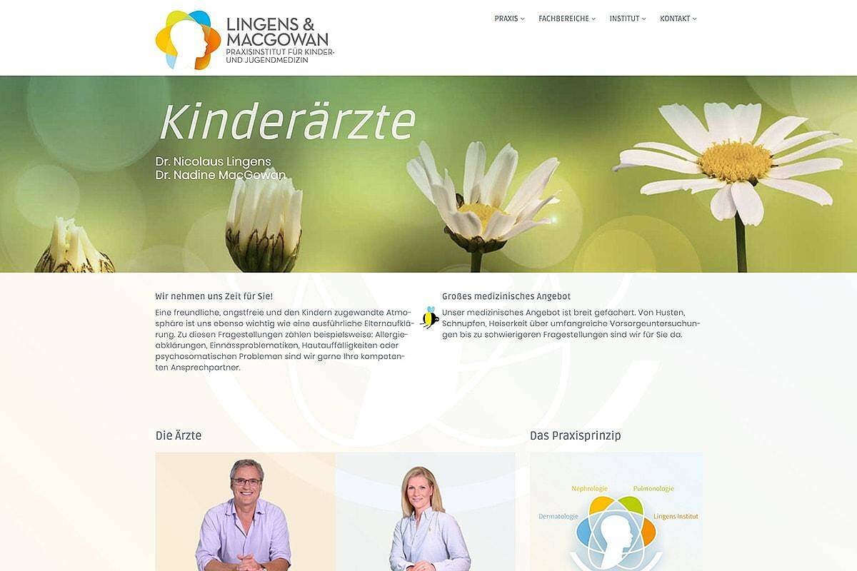
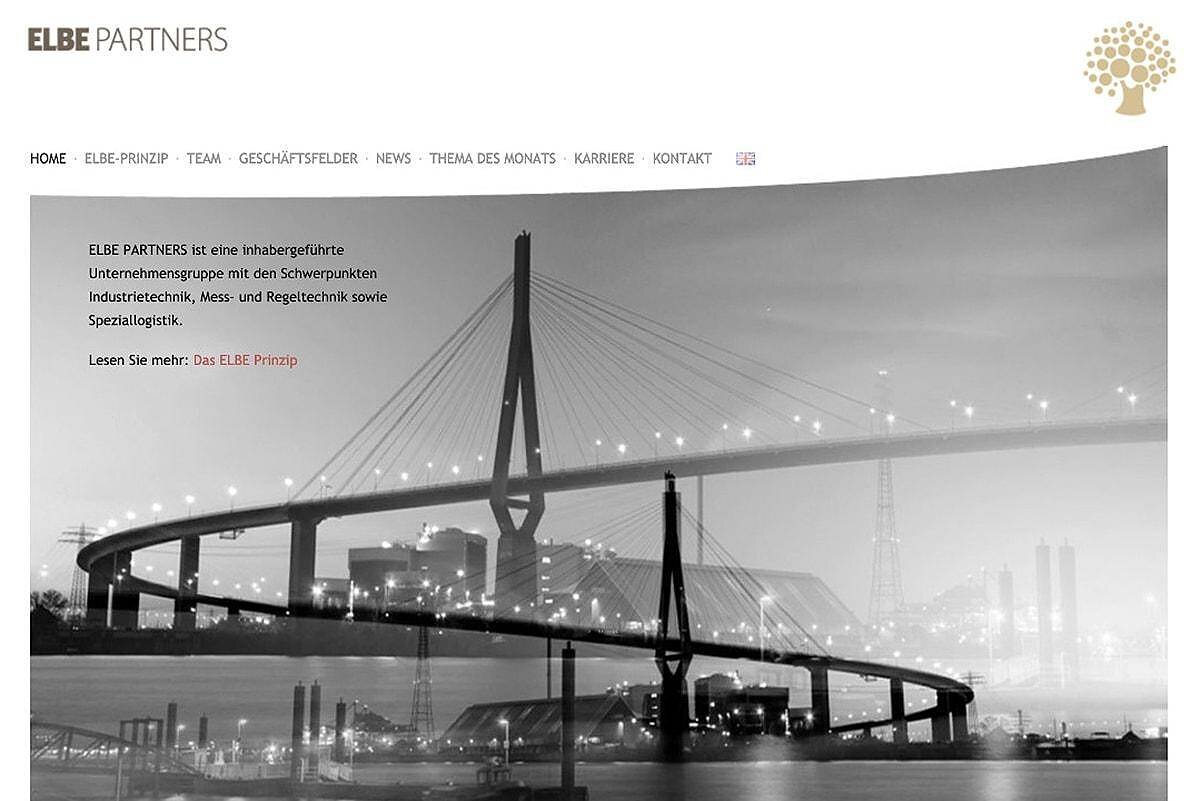
Examples (Responsive Design)
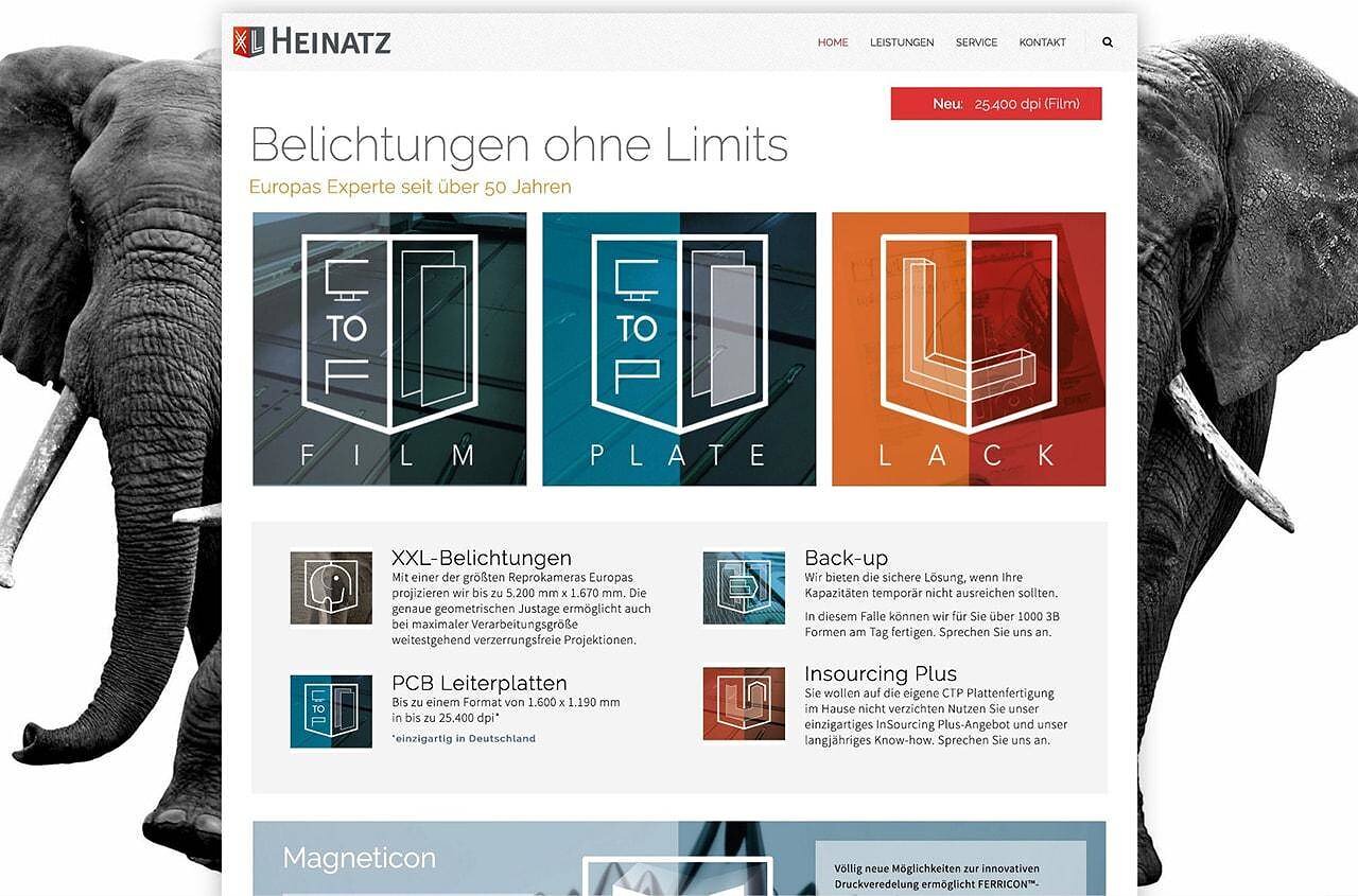
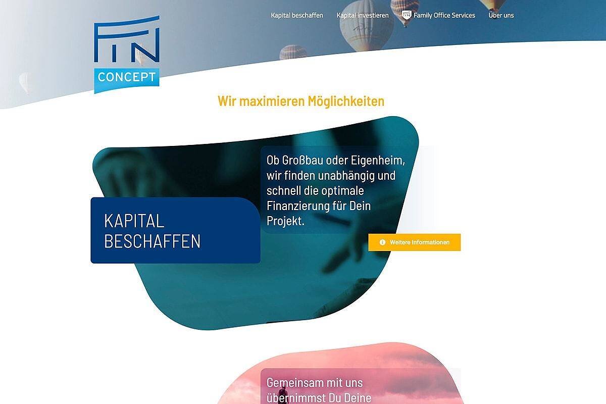
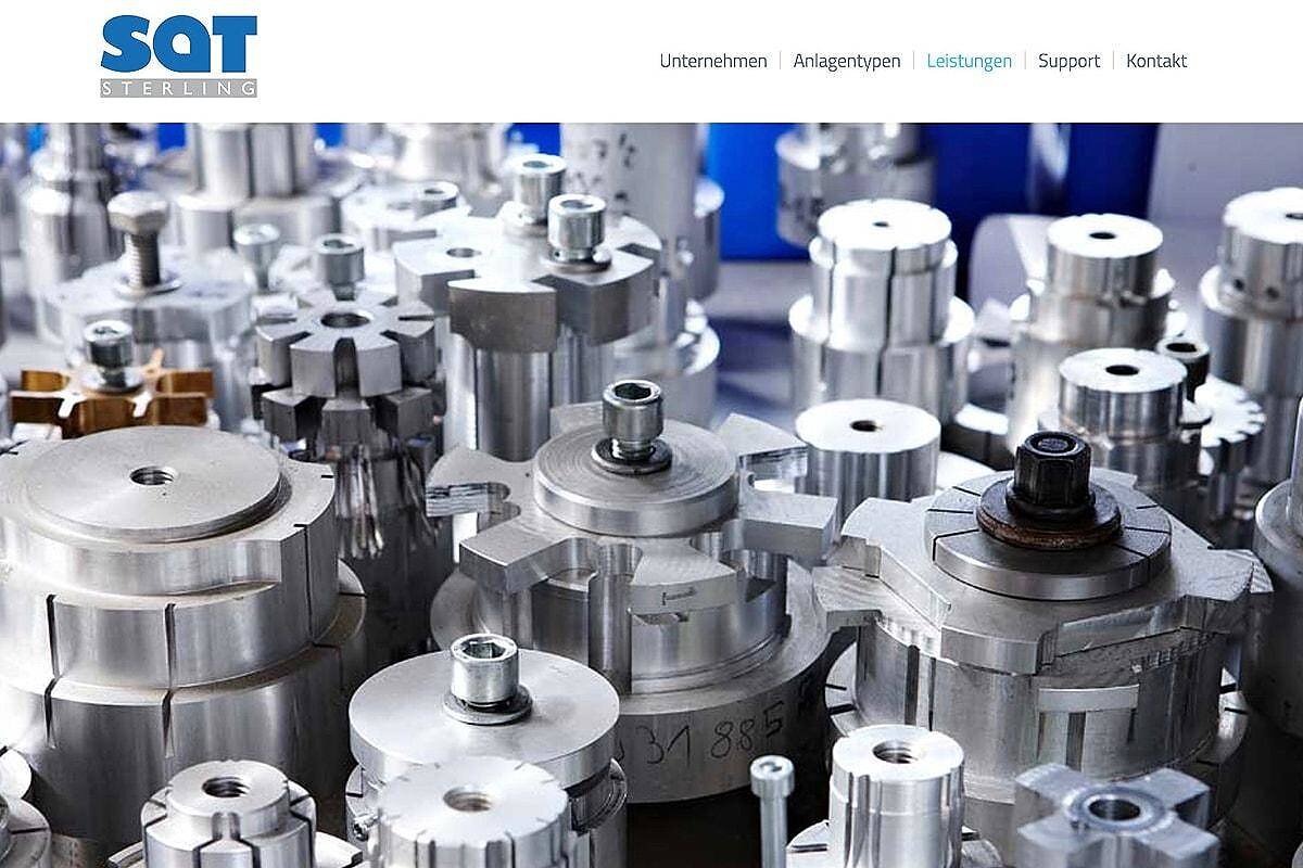
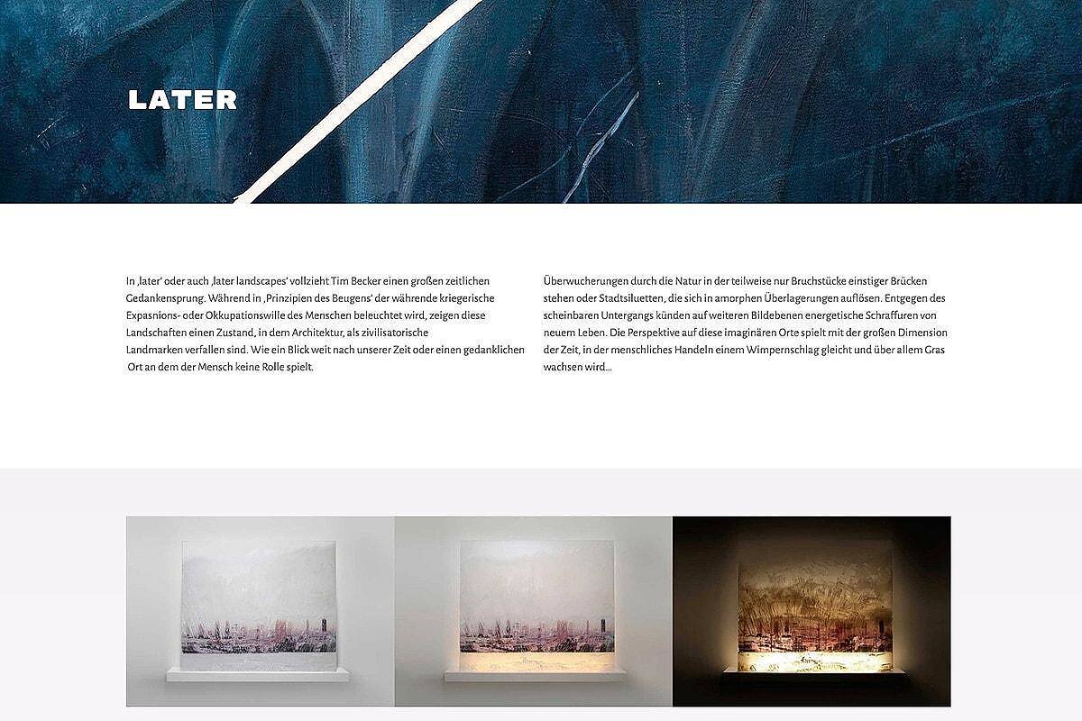
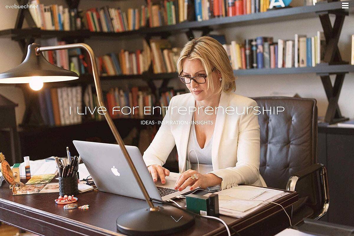
In preparation – Here we show examples of our projects. Our websites work automatically on all common browsers and mobile devices and adapt accordingly (“responsive”).
Also visit our design website of the TBA-Hamburg.